About Me

Product: “A good, service, or idea consisting of a number of tangible and intangible attributes, brought into existence by intellectual or creative ability

Conceptualizing a Product….what it does and how it does it. How it is presented, how users interact with it and what needs to happen for it to be realized.  That’s what I do – and have been doing for my entire professional life.

Creation:  “The action or process of bringing something into existence.”

I am a visualizer and realizer – able to conceptualize a product or feature-set, see the bigger picture and create compelling solutions.

Design: “The art of conceiving of and producing a plan or drawing of something before it is made.”

Highly creative and super-critical of both aesthetics and function, designing something that is visually stimulating, effective in use and answers the needs of users is a combination of skills acquired over many years of doing just that.

Experience:  “Practical contact with and observation of facts or events.”

This is where the potential for success of a product is established. Research, observation, interpretation and designing engaging experiences based on real people in real situations.

Management:  The process of dealing with or controlling things or people.”

The final piece of the picture is bringing it all together – understanding and planning what needs to happen, who needs to do it, how long it will take and how much it will cost.


The work below is a brief overview of some of the products and projects I have been involved with, along with background information and supporting media to give an insight into the creation process and my personal perspectives.

Late Nite Labs

Co-founder / Head of Product

As co-founder of Late Nite Labs I had the opportunity to create a product from an entirely new and unique vision – that of enabling students to study science by performing scientific experiments in a browser-based virtual environment and using accurate scientific data to drive the results. Back in the early 2000’s, this was a pioneering concept that presented many challenges.

Ultimately it resulted in the Late Nite Labs Simulation Platform for chemistry and biology labs that was adopted by over 150 educational faculties across the US and used by more than 100k students.

The company was acquired by Macmillan in 2012 as part of their New Ventures initiative and physics, microbiology and ecology were added to the educational disciplines.

I continue to lead the production of the lab simulations as a consultant and Head of Product for Simulations.

Product Concept & Design

As with any design project, the visual presentation of Late Nite Lab’s lab simulations stems form many, MANY conversations. Conversations with professors, instructors, teaching assistants, course-ware designers, faculty heads and, of course… students.

A vital take-away from these early and on-going conversations was that there has to be a high degree of “transferable knowledge”…. knowledge gained in the simulated world that could be later applied in the real lab environment – the simulations have to give students a sense of being “in” that lab environment, and the surroundings and equipment they are presented with have to have a reasonable correlation with items they would be interacting with and experiencing in the wet lab.

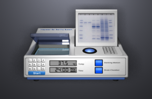
Of course, being a virtual world, there are some liberties that can be taken and rules that can be bent…. the “Gel Staining System” that I devised for the DNA testing labs is a case in point. This is a custom piece of lab equipment doesn’t exist in real life – although it should and I am seriously tempted to put a patent on it!!

The point being that designs should enable or enhance the transfer of knowledge….and that holds true for any design, regardless of platform or purpose.

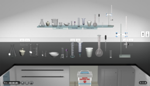
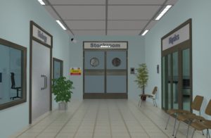
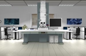
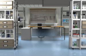
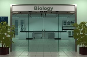
Below are some examples of the Late Nite Labs virtual lab simulations environment:

2016-11-19_1024
corridor electronmicroscope0033
stockroom_entrance0049

The link below is an example of a Product Roadmap for mid-semester platform updates:

Platform Updates v2.1


Interaction & UX Design

The UX strategy for the Late Nite Labs simulations presents a number of challenges. Although the labs are generally organized by discipline, each lab is different, has different equipment, procedures and interactions…. and there’s more than 150 labs spread across 6 disciplines!! It is necessary therefore to organize the UX tasks into a number of sub categories, with appropriate methodologies for analyzing, implementing and testing. This of course also fits appropriately into a “Lean” UX model.

Lab Environment:

The overall “feel” of the lab environment has always been a crucial factor in the design decisions. We wanted the labs to afford the user an environment where they can perform serious work without being hindered or distracted by that environment. Sounds trivial….but it isn’t!!

The first step in solving this problem is the users themselves. We spent many months in the first two or three years of the company’s life travelling around universities, colleges and faculties speaking to potential users and getting a feel for the scope of the problem we were trying to address.

From these meetings and interviews, Personas were developed to act as guiding representations, informing design and product decisions. We drew-up preliminary design comps and discussed different methods of deployment which we put to focus groups – the resulting feedback was used to refine the designs.

We implemented a series of usability testing sessions using a selection of students and instructors to further identify any pain-points.

Interactions:

When it came to discussing how the user would work in the lab, we were again looking to maximize the flexibility that a virtual environment offers, whilst keeping the interactions intuitive and true to how a user would be working in a real lab.

General requirements, like dropping and grouping labware had to be correct and logical from the perspective of real labware usage…. this was a critical requirement of the majority of instructors. For example:

  • a beaker is placed on a balance
  • a thermometer is placed in the beaker
  • an Erlenmeyer flask is placed on a Bunsen burner

All these interaction rules (over 450 in total!) had to be defined in advance of any development work and required the creation of many interaction maps and use-case definitions, which were submitted to subject matter experts for review and refined accordingly.

Additionally, labware-specific designs and interactions were defined in collaboration with subject matter exerts on an item-by-item basis, resulting in prototypes of both visual and interaction designs for each piece of lab equipment. Usability testing was then conducted on each item of labware in the context of the experiments being performed.

The links below show a very small selection of documents generated as part of the UX and interaction design effort:
Burette – Use-case
Spectrophotometer– Interactions map
Spectrophotometer – Use-case
Spectrophotometer – Wireframe prototype
Bunsen Burner – Use-case


ListenUP!

Creator / Product Design & Management

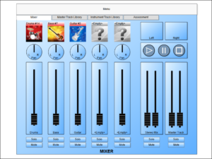
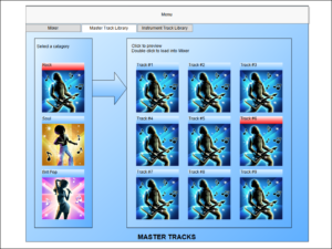
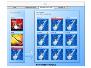
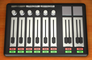
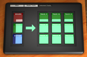
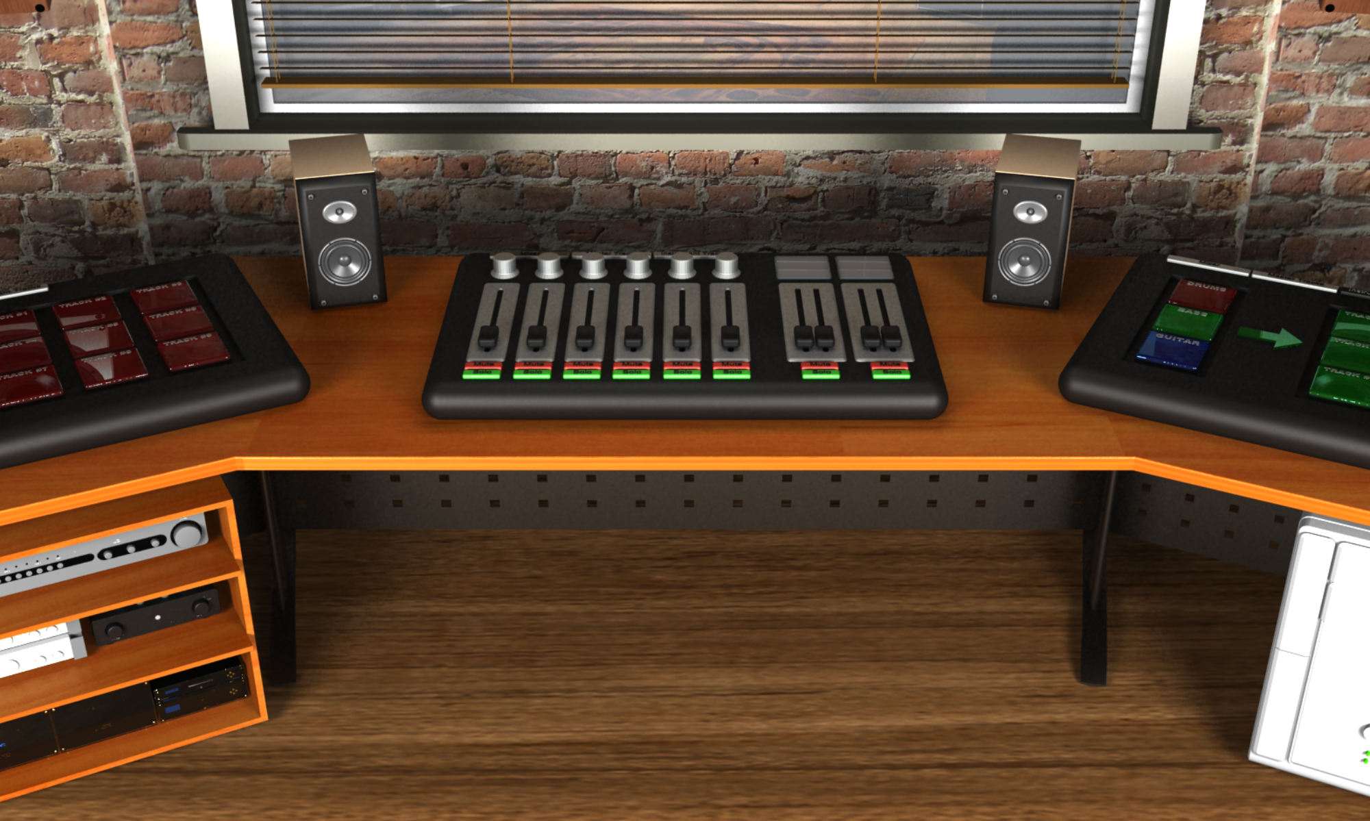
ListenUP! is an educational software game in which users are trained to listen to, and identify the various instruments in a  piece of music. They are given a number of pre-recorded  music tracks (“Master Tracks”) to choose from and a library of solo instruments, organized by type. Each instrument type has a collection of solo parts or tracks to choose from (“Instrument Tracks”). The objective is to identify the correct individual instruments and tracks that make-up the chosen piece of music, then ‘mix’ them in an audio mixing console so that the mixed piece resembles the original as closely as possible.

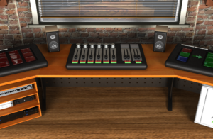
The vision for ListenUP! is that it will be played in a Virtual Reality environment, where the users can freely explore the surroundings, interact with equipment and experience true 3D sound, with the goal of learning about recorded sound and music.

ListenUP! is in initial development with beta testing scheduled to begin in the summer of 2017

Concept Development & Design

Many people listen to and enjoy music on a very surface level. Whilst there is nothing wrong with this, a deeper understanding of the structure, instrumentation and arrangement of recorded music heightens the appreciation of the piece and enhances the ability for critical listening, regardless of the style of music or what instruments are present.

As a musician and sound engineer from a previous life, the ability to “listen”….really listen, and hear all that’s happening in a piece of music, opens-up a whole world beyond the surface level of the piece. That world is endlessly fascinating for me and is not something that is taught within the current framework of music studies.

The concept, therefore, is a game that will allow users to explore the depths of a piece of music by identifying the various individual instruments within the piece and then attempting to recreate a “mix” of that piece by selecting from a library of solo instrument tracks.

The setting for this is a virtual recording studio with mixing console and other pieces of sound processing equipment traditionally found in studios.

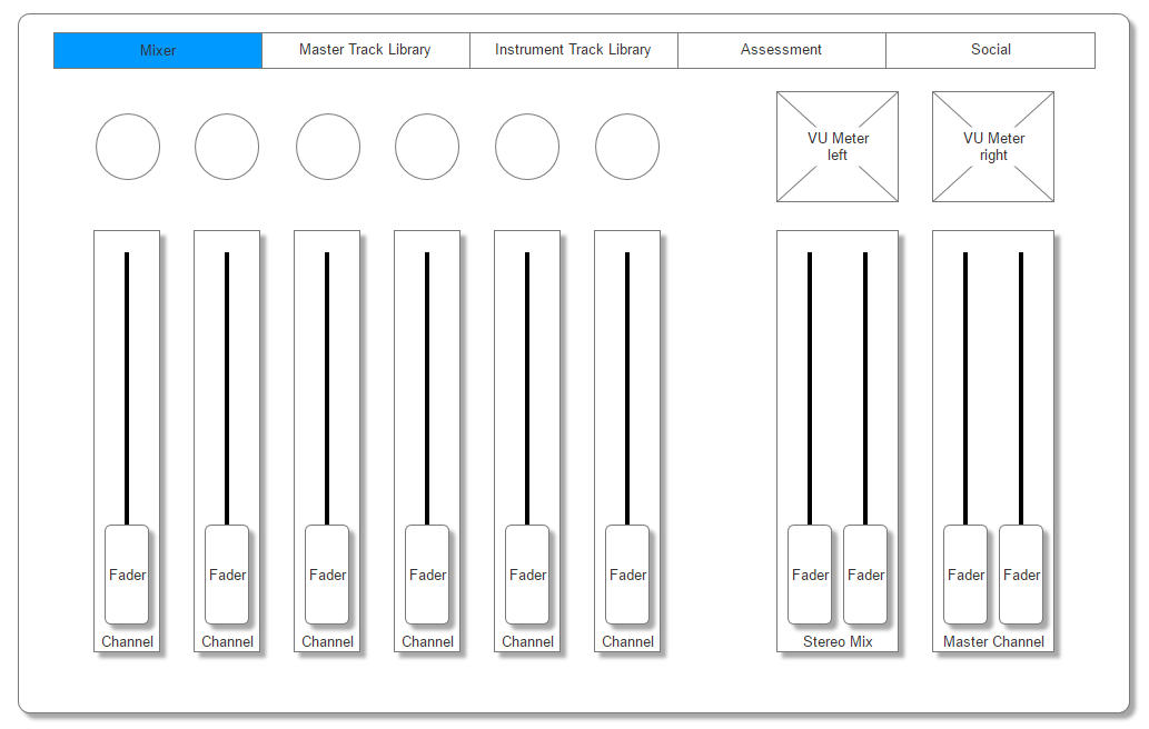
The images below link to supporting media and documents.

Product Vision:

Product Vision Document


Wireframes and prototypes:

mixer0101
instrumenttracks0101 mixer0070

Demo prototype showing game entrance, mixer, mastertracks and instruments view:


CathWorks

User Experience & Design Consultant

CathWorks is a medical devices company located in Ra’anana, Israel. Their core product (“FFRangio™”) is a technology that models blood pressure differences across coronary artery stenosis by running algorithms on angiogram data to form precise three-dimensional flow models.

I was commissioned by CathWorks to perform on-going interaction, usability and user interface consulting to improve the experience of working with this ground-breaking technology and, more broadly, to promote a culture of Design Thinking within the company.


The challenge with this particular application is the context in which it is used. The Catheterization Lab is a busy, often intense environment in which to use software and a thorough understanding of the setting and on-site conditions was necessary, as this has a direct bearing on the nature and appropriateness of design choices.  Size and layout of physical space, how many people are present in that space at any one time, level of activity (noise, stress), lighting, bedside (or patient) accessibility all contribute valuable information to models of interaction and user-flow.

A primary concern was the impact on daily working routines and practices of all those in the lab. How can this system best be integrated into those practices with the minimum of disruption….physical or procedural. Any new system needs to be super-transparent for those in the clinical environment in which it’s used, so whether that’s time-on-task, functionality, layout or required actions (and interactions), all these need to be as unobtrusive to the current working practices as possible.

This extends to a parallel course of research into the potential users of the application. The CathWorks system is a little different from other, possibly more ‘traditional’ UX projects in that the users are a very specific group of clinical technicians that receive dedicated training on the system. However, this does not mean that ‘traditional’ methods of user research don’t apply or can be taken lightly. On the contrary, these users are operating in a highly technical environment, controlling several different complex systems at once and constantly responding to requests from physicians as the procedures are performed. Empathizing and fully understanding this group, their working practices and needs is paramount in identifying and implementing design strategies that result in an effective and efficient experience.

FFRangio® is a registered trademark of CathWorks Ltd.

https://cath.works/


Capriza

Usability Consultant

Capriza enables enterprises to take their business enterprise mobile. Mobile-enabling business applications un-tethers users from their desks and allows them to focus on developing a competitive advantage.

I was commissioned to perform a usability study of Capriza’s products during the beta phase of development. This involved in-depth user analysis , profiling and persona creation, which was followed up by a series of usability testing sessions, performed over several days in an monitored environment.

The resulting usability report can be best described by Oren Ariel – Capriza’s founder and CTO:

We hired Pat as an independent consultant to conduct a usability review on Capriza’s product prior to launching it into Beta. He produced a usability report that was a real eye-opener for us. His observations were spot-on with some of the initial feedback we were getting and validated our suspicions that our product was too hard to use. Pat is highly professional individual who deeply understands user experience and the art of simplification. His experience in making software products intuitive to use, and his precise recommendations for improvement contributed significantly to the success of our Beta program.


The link below shows a Mind Map of user testing analysis for Capriza’s “Designer” application:

Capriza Designer – Mind Map